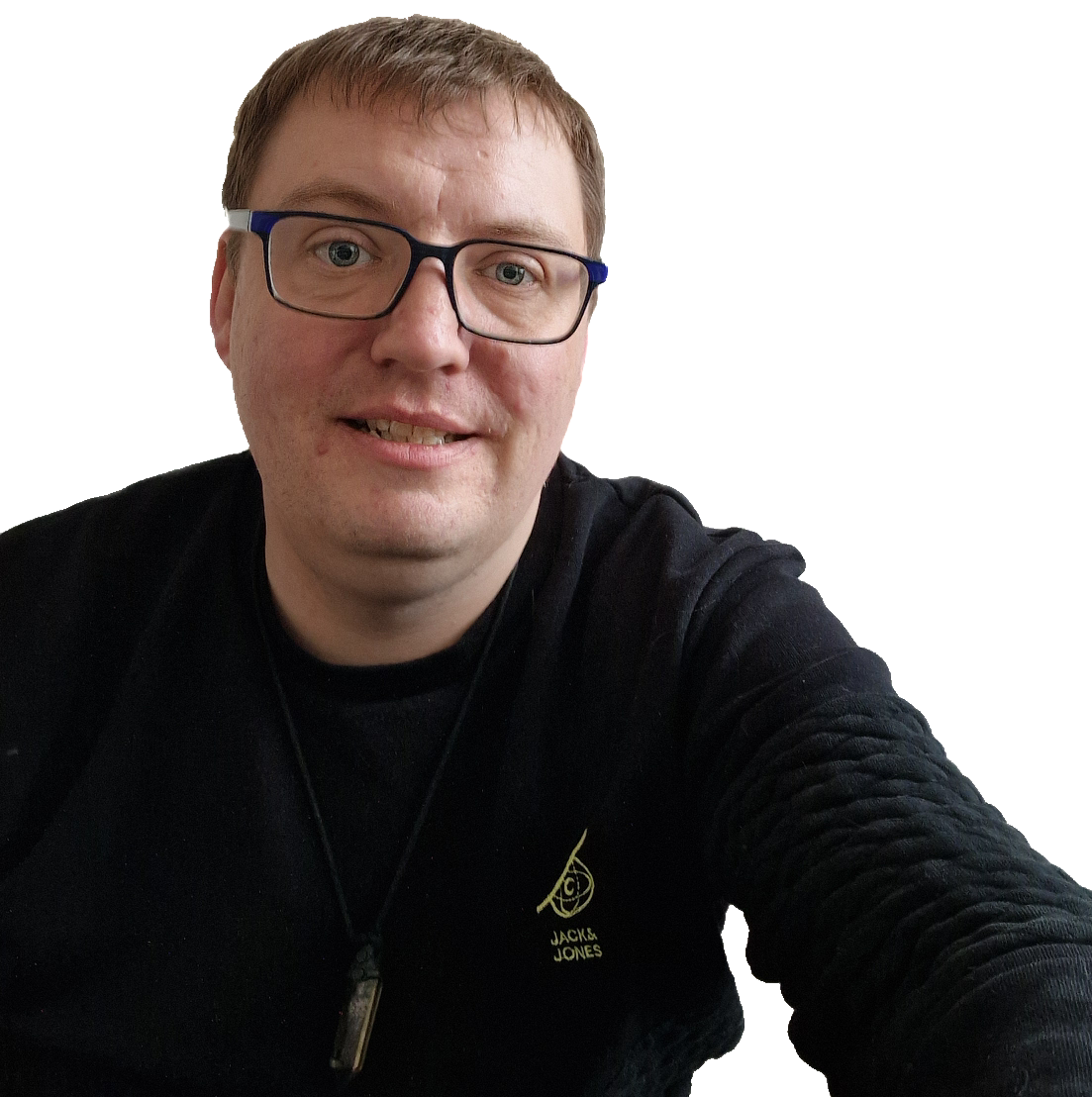
I wanted a new design that was less formal than the last. I suffered from wordpress-theme-depression after being unable to find a theme that I like. In the end I decided to take the Plainscape design and tweak it.
It’s not exactly as I want it, so let’s call it a work in progress, kind of like me. As always, you can let me know what you think by leaving a comment. If you want to compare it to previous designs see Geeky Post: Website Development.
Write soon,
Antony
Sign up to my monthly newsletter:


Wow, the cartoon tile effect looks quite alright, kinda reflect how crazy things can get for you <3
If I might make a suggestion: I love the colour scheme, but add some padding to the post tables, give the words a bit of room before starting a new line (makes things look a little less cramped I always feel.)
Look forward to seeing what it looks like when its done!
Sye x
Hi Sye,
Thanks for the suggestion, still getting used to the CSS! Will try adding the padding in a bit and hopefully it will work, as I was thinking the same thing!
And yes – crazy was the look I was going for lol!
A x
Better? Still a work in progress, lol, got the header to sort properly and the footer. Need your help too in fixing my logo image, that for some reason I only with blue eyes as an avvy. Think I have the original Adobe photoshop doc, but unable to edit it my self as don’t have Adobe photoshop.
A x
No problemo I’ll head down some time with my laptop. Actually, I’ve been considering making the shift to a wordpress blog hosted privately to kick start the new year, but I’ll need your help with WP.
We’ll do lunch ;D
– Sye.
(PS: Yes, much better!)