Tag

HTML

Blog Development: A Complete Theme Redesign by TRH Development

By LifeNo Comments
people-per-hour-logo Over the years my blog theme had become out of date and the CSS had been cannibalised. So I was looking for a WordPress expert to do a complete redesign of the current theme. I found Tia from from TRH Development on people per hour.

I explained to Tia what I wanted, we agreed a price and she got to work. My role was to give her feedback as we went along. Here’s a list of work Tia did for me:

  • Complete redesign of my blog using a child theme of Twenty Fourteen (to allow for theme updates).
  • Coded to the highest HTML5 and CSS3 standards. This CSS3 was essential as the style sheet on my old theme had been cannibalised over the years and was full of conflicts.
  • WordPress Menu Functionality – including support for sub-menus. A major reason for this update was to allow me to use the added functionality features of WordPress.
  • A mobile/tablet version of the site.
  • The ability for the reader to Switch between the Desktop/Mobile versions, which is possible by using a link in the footer.
  • Removal of the ‘Go’ button with the search input field.
  • Archives expand to include post titles.
  • Photo caption boxes have been slimed down at the sides, making them stylistically look better.
  • Various minor tweaks based on my feedback to make the theme’s look as close as possible to the old theme.

Tia also added two great new features:

  • Pagination – which is the page bar under the blog posts on the home page. I really like this page browsing experience for readers.
  • Lightbox image viewer with play/pause slideshow. I love this. I have some great photos. Now if you click any image on a photo post or page (such as Photos) it brings up the image full size without leaving the page and allows you to play/pause a slideshow.

To follow on from Tia’s superb work, I also made a few minor tweaks to the blog myself:

  • Changed the font from Arial to Verdana.
  • Removal of the large Amazon banner on the sidebar.
  • Added book cover thumbnail images on the I’m Reading and On My Bookshelf sections on the sidebar.
  • Changed UL in style sheet to square.

Tia at TRH Development was awesome. I intend on using her again, probably later in the year, to design me a WordPress theme for my professional writers website. My feedback for Tia on people per hour really says it all:

Awesome. Brilliant. Excellent Communicator. Job done to the highest standard. I can’t heap enough praise on Tia for the expert knowledge & skills along with her professionalism. Am already planning my next project with her.

So if you need a Developer for a website, I highly recommend Tia from TRH Development.

Blog soon,

Antony

Share on Social Media:

WordPress: Content Plugins

By Creativity, Technology, The WebNo Comments

I’ve recently installed two content plugins on my blog: Random Images for WordPress and WordPress Related Posts. The aims for these plugins were to recycle older content and direct visitors to other posts/pages of interest. From the sites statistics they’ve been a huge success. So let me tell you about the plugins:

random-image-screenshot
(Random Image for WordPress Screenshot)
Random Image for WordPress by Justin Watt
About:
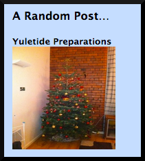
Random Image for WordPress displays a random blog post title and image on the sidebar. It will only display posts with an image, those without it won’t display. But it has lots of customisable features, that are easily tweaked on a settings page (Settings – Random Image).

Features:

  • Sort images randomly or show recent images.
  • Edit the HTML template for how post titles, images and captions are shown.
  • Select from ALL or only specific categories/tags – very useful if I say only wanted to show book reviews. It’s set up for all at the moment.
  • Customisable image width and height.
  • Able to take images from galleries.

Link(s):
Plugin’s Page @ Justin Watts

This plugin is easy to install and use. It’s great because of it’s position on the sidebar. It catches the readers eye and if the title or image spark they’re interest, they can click for a view. It’s a brilliant way to recycle old content; but the randomness has it’s pro’s and con’s. The pro is that on the homepage, it’s good as you don’t know what the visitor is into so it gives a variety of content, changing on every refresh. The con is that on specific posts it doesn’t link to simliar posts.

Which is why I’ve installed WordPress Related Posts:

related-posts-screenshot
(WordPress Related Posts Screenshot)
WordPress Related Posts
About:
WordPress Related Posts displays other related posts at the bottom of the post page the visitor is on. So for example, if you’ve come to a book review post, it will offer you other book reviews, possibly by the same author. It clearly links together appropriate posts and if you’re not satisfied with the results, you can choose which posts appear on that particular page. It has it’s own settings page (Related Posts on your Dashboard left sidebar) making it easy to customise the many features.

Features:

  • Highly customisable, you can choose to display or not: Title (before related posts links/images), number of posts, the number of comments, the publish date and an excerpt (max 200 words).
  • It can include or exclude a thumbnail image. I choose to exclude a thumbnail image, as I don’t want to distract the viewer from the post they’ve come to. I simply want to offer the viewer suggestions before they leave.
  • Choose a default image, for posts without an image.
  • Choose which posts are displayed on a post, if your not happy with the ones the plugin suggests. Although I have to say the plugin does it automatically very well.
  • CSS customisable.
  • Adjust the formatting for a mobile device.
  • Pageviews & click Statistics (if you sign up to it).
  • Choose to exclude certain Categories.

Link(s):
Plugin Page @ WordPress
Zemanta Ltd. Website

This plugin was easy to install and use. I’m still experimenting with this plugin, in terms of what format works best but it seems to be doing what I want it to do: directing visitors to other posts of interest. It’s useful for me as I write about the same sort of things. I guess if your content was varied and didn’t have simliar themes it wouldn’t be useful to you.

These plugins are helping to increase the time visitors spend on my site and helping them notice some of my other content. However, it means that I’ve got to create great, regular and orignal content that they will want to view.

Blog soon,

Antony


I aim for posts on this blog to be informative, educational and entertaining. If you have found this post useful or enjoyable, please consider making a contribution by Paypal:


Share on Social Media:

Geeky Post: Website Development

By Technology, The Web3 Comments

This is a Geeky post and in it I’m going to show you how my website has developed over the years.

Version 1
My first version was created in HTML and looked like this:

It had sections to it: Personal, Carrer and Occult. It had Quick Links News on the home page.

The Navigation was simplistic as was the site as a whole. This first version of the site was online when I was 16 years old and at that time I didn’t have the domain antonysimpson.com.

Version 2

Version 2 was designed with sidebar Navigation in order to allow me to populate the site with much more content. It again was designed in HTML using tables. It contained much more photos than Version 1 including a photo’s section.


New features included a News page that had paragraphs of my news including Site Updates to let the visitors know what had been developed and updated. The Occult section of Version 1 became religion as I accepted Paganism as part of my religion. This version of the site was online around the time when I was 18 years old.

Version 3

Most significantly in Version 3 was the new blue design. I kept the sidebar navigation as I liked that it allowed me to populate the rest of the site with more content. The site used a combination of HTML and PHP, using Iframes. Removed the Site Updates but added on a Last Updated sentence on the home page so that people know when it was last updated.


The news section (above) had a page per news entry and an archive like a blog.

Version 4

Kept the same blue colours design. Kept the last updated sentence on the home page. Moved the Navigation to the top of the page. The main feature of this site was a wordpress blog which unfortunately I deleted being unable to pull off the posts and saving them. This was probably the shortest version of the site ever online, really I only focused on the blog.

Version 5

Again I kept the blue design (look above). It was the most advanced coding I had done so far. I liked the photos and had more of them to use as technology developed. I kept the Last Updated sentence and added a hit counter.


I created a windows-style little windows for the content. For the first time I had a guestbook.

Version 6

The major change in this design was the colours, using oranges and reds. The site design was the same, but I uploaded much more content.

Version 7

Easier on the eye colours were used. Advanced PHP coding used. Meta tags added so that I would appear in search results. For the first time I used an RSS feed. This was probably one of the longest sites online.

Navigation returned the sidebar with little yellow star bullet points! I discovered photoshop and used it to make my own banners. Put news on the home page. Kept expanding the site adding new sections and pages.

Also added Coming Soon – so that visitors would know what new content was to be added and Site Updates makes a return so visitors know what’s been recently updated.

Version 8

My friend Sye designed this site for me. I asked him to design it after seeing his cartoon artwork (see Funny cartoons from a friend and More funny cartoons from a friend). The idea was to create a noticeboard with a piece of paper pinned on to it. The Navigation was cartoon images that changed on mouse over at the top of the page.

The site was designed in dreamweaver using tables in a blog style. I also had a cartoon logo designed by Sye. I decided to have a wordpress blog for the home page and made some minor changes to the design to accommodate this to the version you see today:

So that’s how my sites developed over the years. Do you think I should make some changes to the current version or create a new version? Post a comment.

Antony

Share on Social Media:
×